ShopDreamUp AI ArtDreamUp

Deviation Actions


Suggested Deviants


Suggested Collections


You Might Like…


Featured in Groups


Comments3
Join the community to add your comment. Already a deviant? Log In
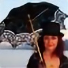
This is a deftly accomplished image. Having attempted to photograph figures lit by a fire that is part of the shot, I know what some of the pitfalls can be. You were able to achieve good lighting on your subject. It looks like you did this by using a slow shutter speed, but not too wide open of an appatture, thus allowing you to have a wide enough depth of field to encompass your subject and the fire. Also, the slow shutter speed allows for a blur from subject movement (the camera is perfectly still as attested to by the stones surrounding the flame). This adds to the ethereal quality invoked by the ritual taking place. The earthyness is accentuated by the "realness" of the photo: there are no technical gimmicks or photoshop manipulation that is immediatly apparent. As this is an earthy subject, I think this was a good way to go. Aside from the hat and the gestures there is no overt device to show this is a pagan ritual. I think this shows respect for your subject matter. The overall effect is that of an image created by someone with a well thought out plan and an idea they new something about, yet part of that plan was capturing a moment in a low tech "seat of your pants" kind of style. I believe this is a very successful image.
Having said that, I believe that people generally ask for critiques because they are seeking information to make themselves the best they can be, so having discussed what works, allow me to make a few comments on where improvement could be made from my point of view. Feel free to disregard these comments if I am off the mark in my assessment, and please know that I have great respect for this piece, and in no way am I trying to take anything away from what you have done. Although i applaud the low tech approach, I think you could still take the image into photoshop and make a few adjustments without losing the realistic feel. first, I would try to light up her face just a bit more. It's actually fine the way it is, but as an artist, I use stock to use as reference. The more detail in the face the better as far as stock is concerned. As an image on its own; a work of art, it is fine and does not need this kind of adjustment. The only other thing I can think of is the appearance of something on the left side of the image. Something caught the light but isn't very clearly defined. If it is important, it should be more defined. If it is not, I would get rid of it. Lastly, a way to have brought more light whether to the face or the image as a whole, would be to have reflection screens off camera to the camera's right and left and possibly above. These can be costly from camera stores but made relatively cheaply and easily with white or reflective cloth from a fabric store. As I say, you can disregard these comments if you don't find them helpful or think they are off the mark from what you are going for. I really like this image. Keep up the good work!
respectfully,
Rod Hillen